Border Radius Crimes on GitHub
As a professional software developer working in open source, I spend most of my day on GitHub. GitHub is essentially a UI wrapper for Git’s core version control system, with a few added features for team planning. The irony? GitHub, a platform that preaches the gospel of code review, doesn’t seem to apply it much to its own front-end.
Here is a short sample of UI errors on the site that make me want to pull my hair out every day. If you look closely, there is an error on almost every piece of UI on GitHub's website. These are usually the kinds of things that any newbie in CSS would instantly know not to do, so it's a wonder that they didn't get caught before being pushed to production, or that they haven't been fixed since (I've been staring at some of these bugs for years).
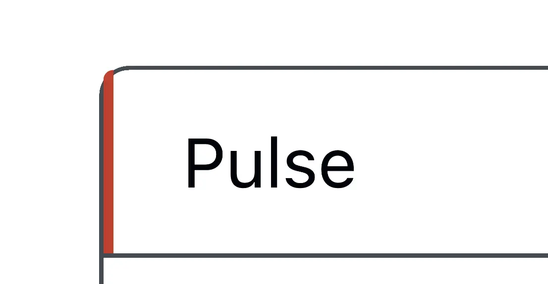
↑ The caret's border is too thin and includes an even thinner border-bottom that it doesn’t need.
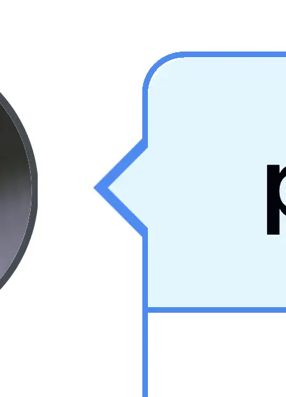
↑ This caret is missing a border and doesn’t correctly overlay its parent.
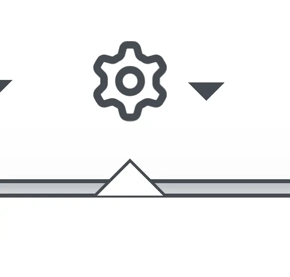
↑ This caret is too thick. Also, the light blue inner corner radius doesn’t match the parent’s, leaving some whitespace.
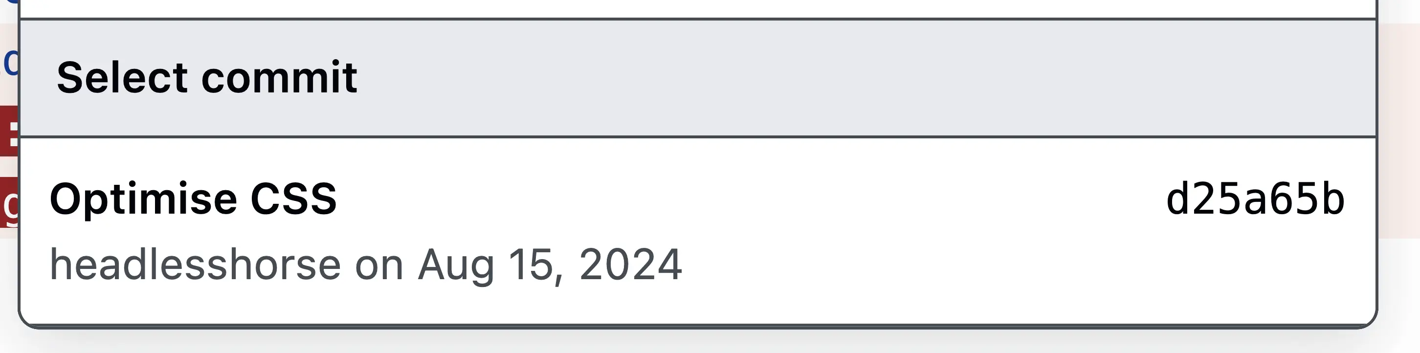
Rule of thumb: a child element’s border radius should be exactly 1px less than its parent.
.parent { border-radius: var(--github-border-radius); }
.child { border-radius: calc(var(--github-border-radius) - 1px); }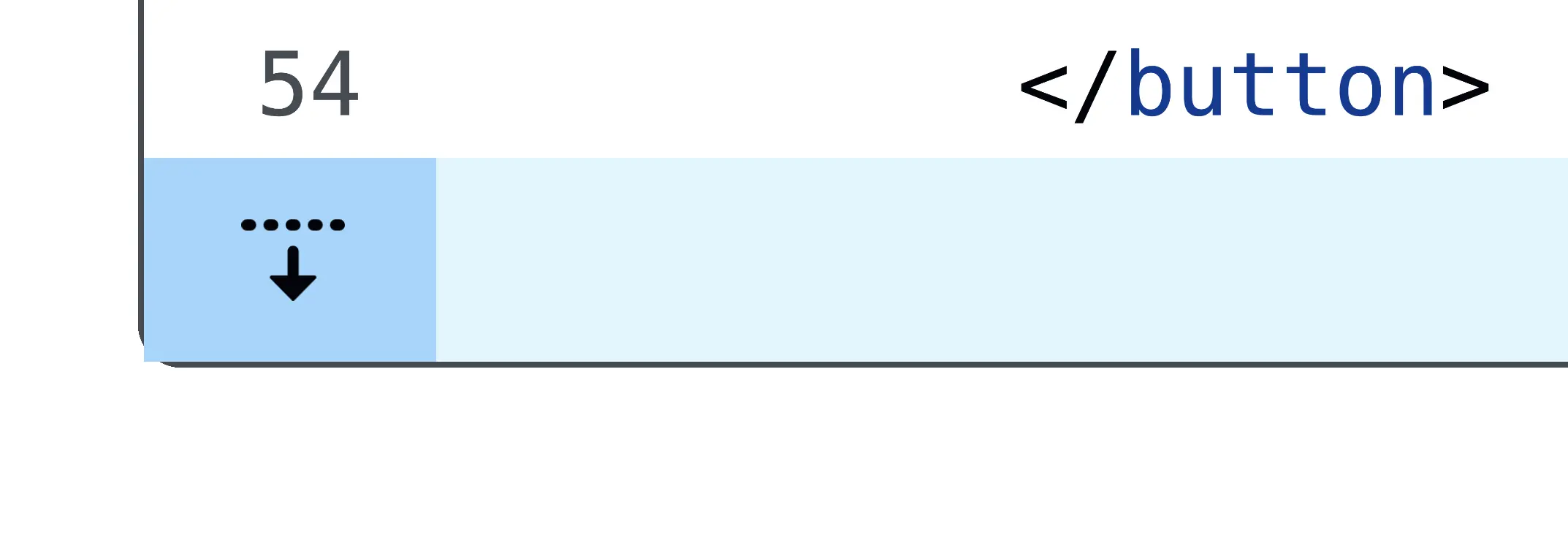
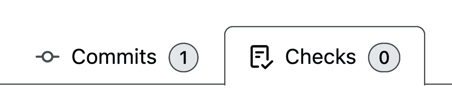
↑ GitHub loves getting border-radius wrong. In the bottom-right corner, we see the child element’s border radius extending beyond the parent container. To fix this, set overflow: hidden on the parent container.

↑ This parent element correctly uses overflow: hidden, but fails to apply border-radius to the child element's border, resulting in clipping. (This bit of UI shouldn't have a border anyway.)

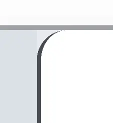
↑ Improperly fitting of boxes here cause a faint white seam at the top border. Often caused by rounding mismatches or sub-pixel rendering errors. This can be fixed with:
border-collapse: collapse;The border-radius is also improperly applied on the bottom two corners.
↑ This element's height exceeds the parent container's height.
box-sizing: border-box;
height: 100%;
↑ This element's bottom corners escape the parent and lack the expected radius.
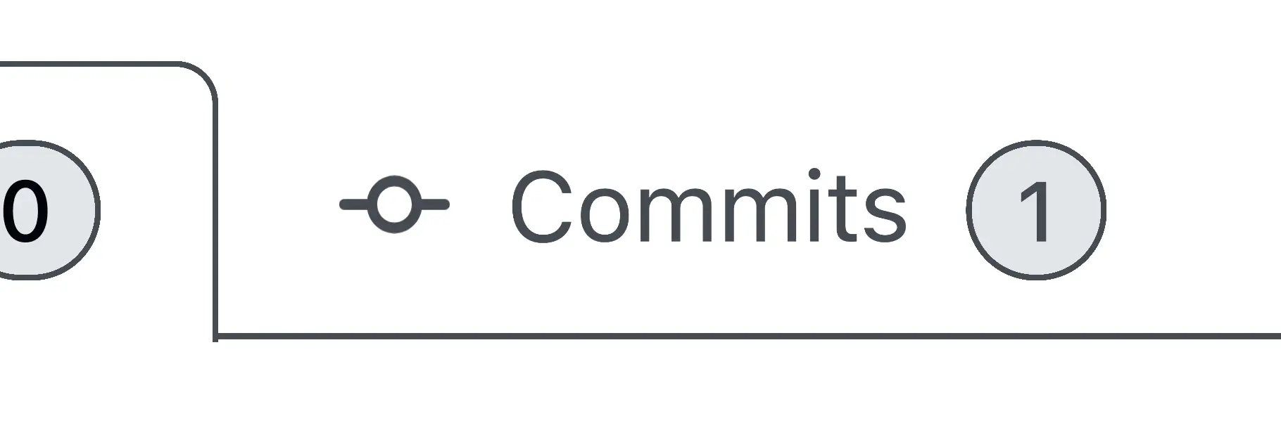
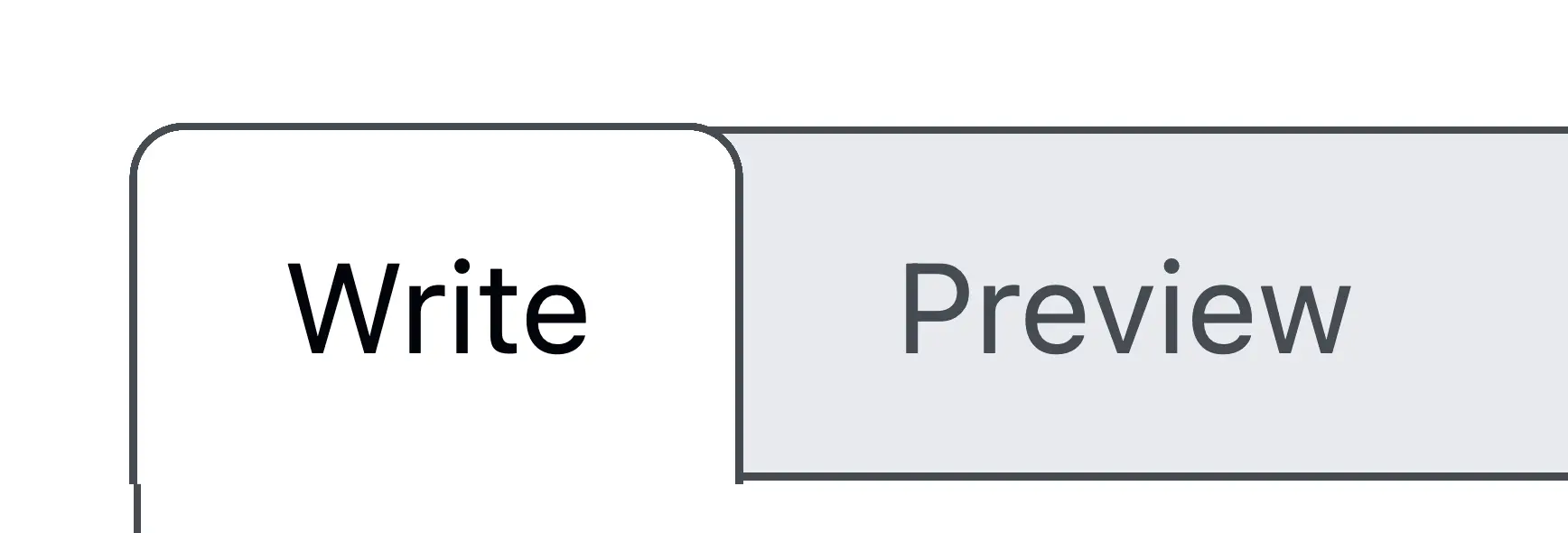
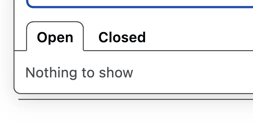
↑ Some tabs have incorrect heights, and the corners do not align squarely.
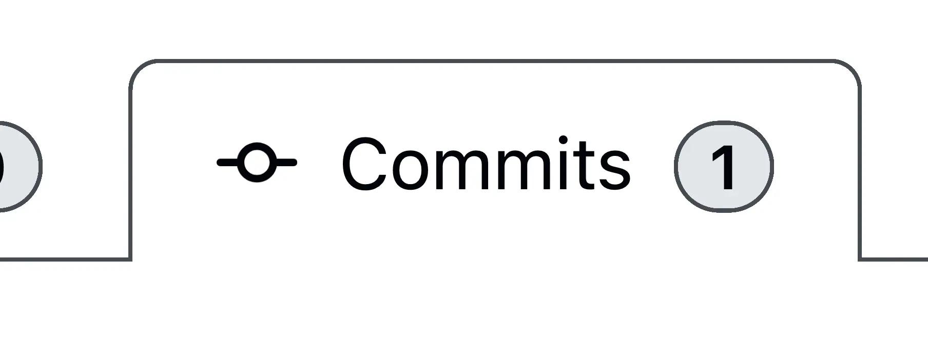
↑ Other tabs are correctly aligned.
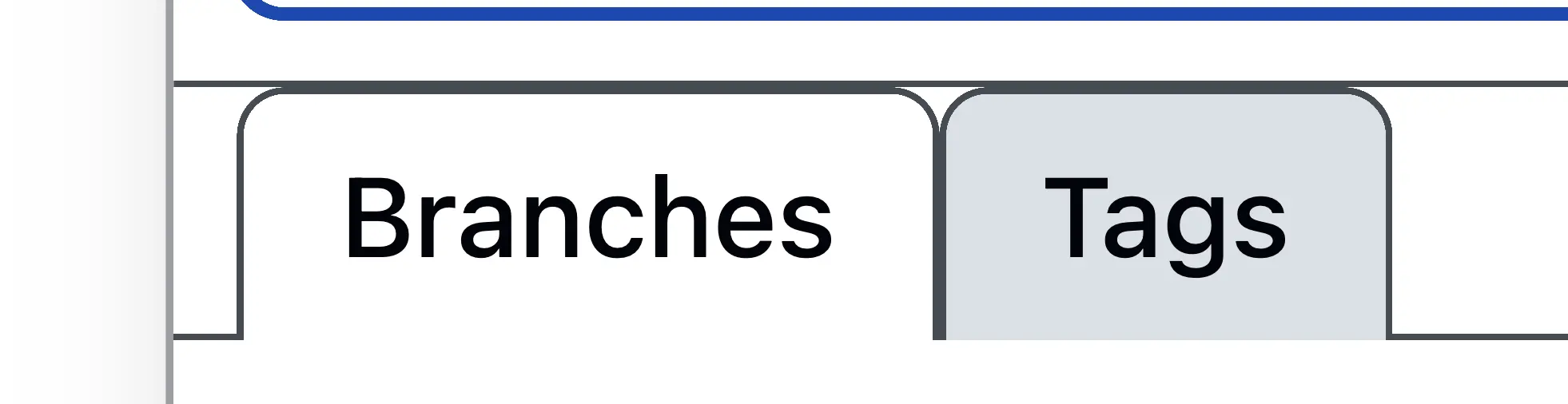
↑ And then they break again.
↑ Some tabs escape their containers entirely.

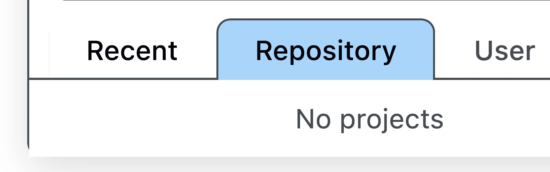
↑ Sometimes an incorrect border-radius causes color breaks at tab meeting points.
↑ Here's a close-up. The border-radius is incorrect, and the background-color is set on the wrong element.
↑ Sometimes tabs are blue.
↑ Other times, they are white, and have beveled corners.
↑ Some tab elements have double borders where they shouldn't. This could use some padding on top, too. It's clear there is no GitHub "Tab" component; each is designed differently.
↑ Borders can appear in various colors. There are five different colors in the picture above. GitHub has an error that loads its stylesheet in the browser 10 times, making it tedious to check whether color variables are being applied correctly.
↑ Sometimes borders are transparent.
↑ Here, the last item in a list has a border-bottom that it shouldn't. You can fix that like this:
ul li:last-child {
  border-bottom: none; /* remove border from the last item */
}
↑ Similar issue here.
↑ Empty lists sometimes display a bottom border unnecessarily. You can use:emptyto fix this:
ul:empty {
  border: none; /* remove any border if the list has no items */
}
But, more than likely, the border is just being applied to the wrong element.
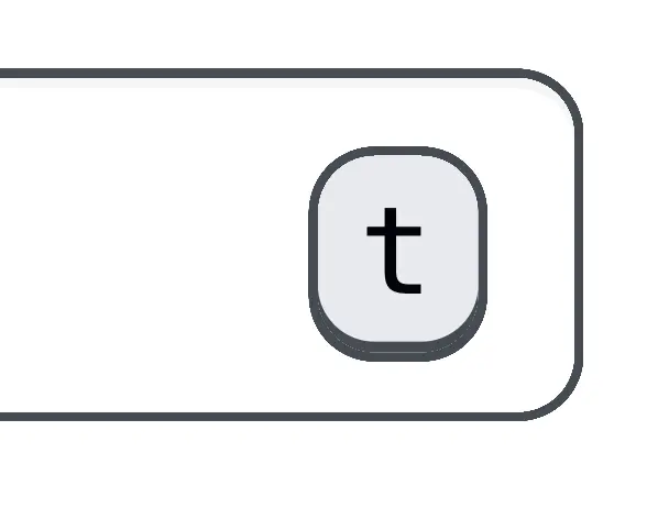
↑ Icons are not centered within their containers. This can be fixed with:
vertical-align: center
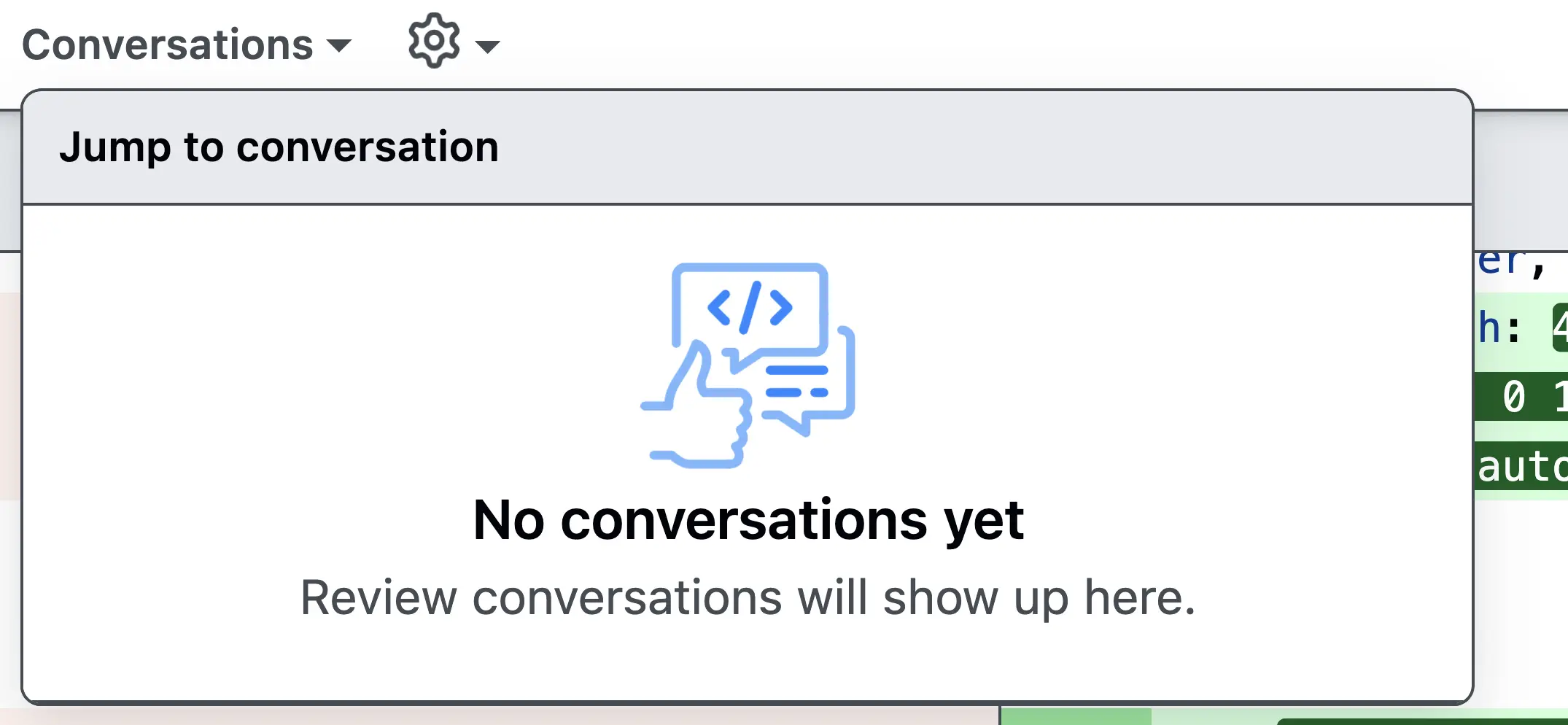
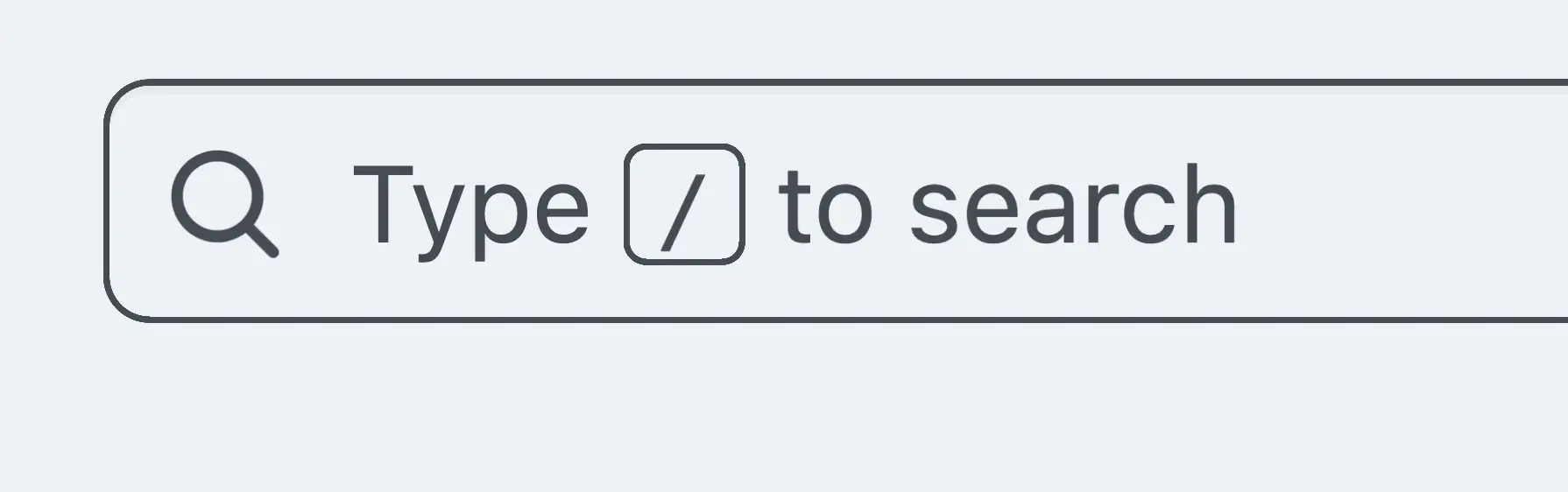
↑ A search bar shows a faint border above is:open.

↑ This box is misaligned.

↑ This one too.
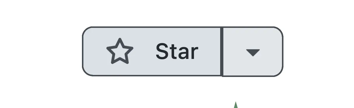
↑ Hovering creates a new border, slightly shifting the Star button.
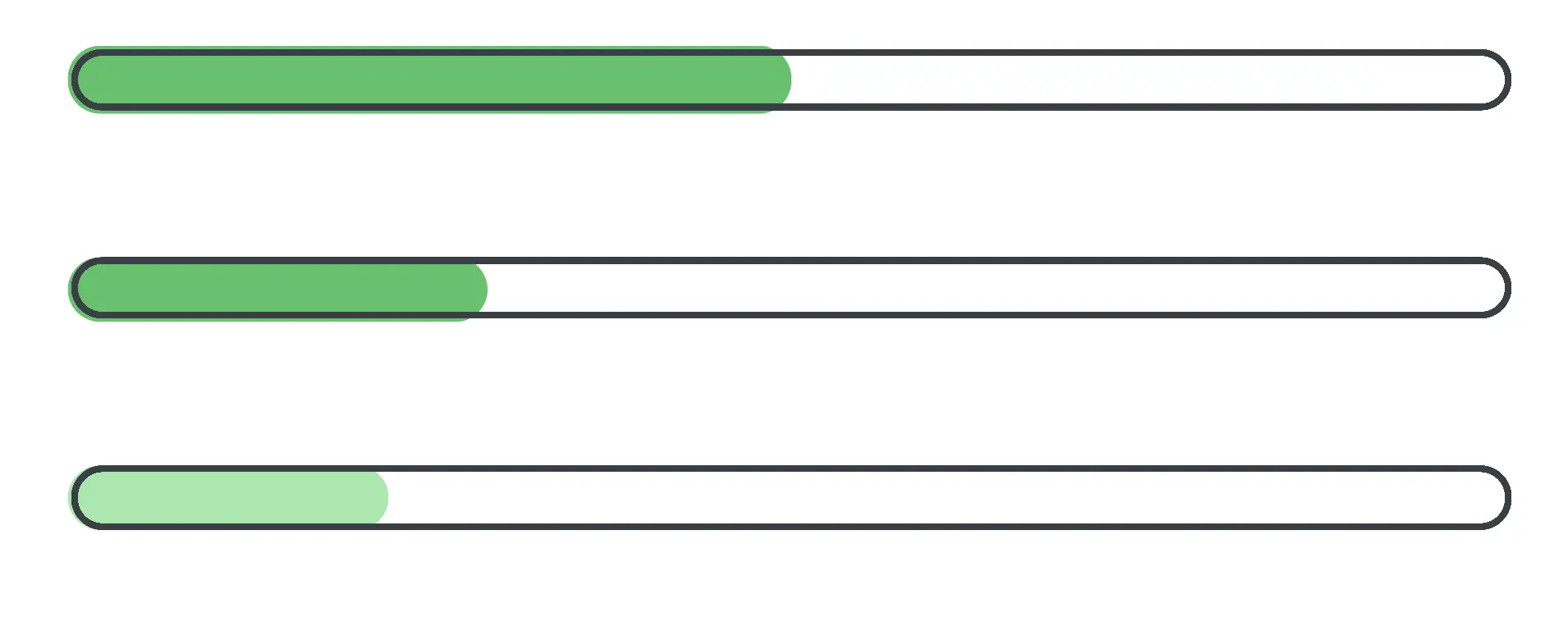
↑ Progress bars extend beyond their parent containers. Here are some possible fixes to add to the parent:
overflow: hidden;
border-radius: inherit;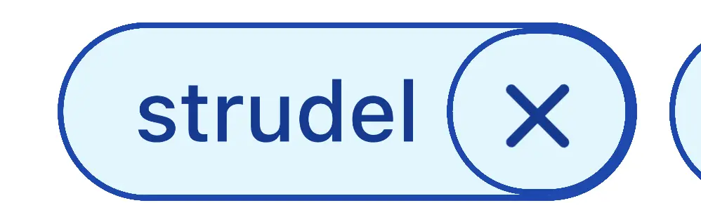
↑ Elements have double borders that shouldn't appear.
↑ Some elements use both border-radius and box-shadow to display edges. This span element has an additional background-color value that adds a visual white sliver between the two, for unusual results.
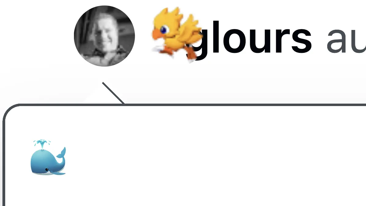
↑ Organization avatars are sometimes square, and personal accounts are sometimes circular.
↑ Occasionally, both types are circular.

↑ Occasionally, they both have two circles.

↑ Avatar borders are sometimes cut off.

↑ This one is a bit more.

↑ The avatar is OK here, but the badge is cut off, and the interior icon is misaligned.

↑ Another avatar cutoff.

↑ Square avatars can be cut off, too.
That's not to mention:
How ridiculously slow the website is. On a website with mostly text content, page load times take forever.
Image rendering is fuzzy across all images. Images are clearly being compressed, then scaled back up to the wrong size.
There is no design system whatsoever. Button-to-button, every piece of UI on the website is slightly different, with different colors, shading, hover effects, affordances, and spacing. It's almost as if each team at GitHub is responsible for a single button, but they have to design it from memory without looking at any of the others.
If you see any other issues you would like to share with me, please don't. My life is hard enough.